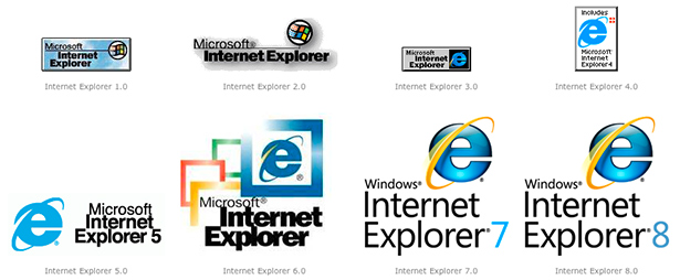
We were all happy to hear that Microsoft has, with its upcoming Windows 10 release, finally seen the light and decided to bury Internet Explorer in a concrete tomb never to be spoken of again. As such it was with great surprise that we received their “new” icon for the new browser known as Edge.

For those living under a rock (or on a Mac) this graphic shows the evolution of professional web users’ most despised browser icon. The inspiration for the new Edge icon is lost on no one. I want to know how Microsoft could come to the sensible decision of retiring internet explorer, yet come to the crazy decision to base the replacement browser’s icon on a horrible relic of the past.
Obviously the decision stems from a desire to avoid alienating users used to an icon that dates back almost 2 decades, but if they were wise enough to decide to ditch a name that many associate with a horrible user experience then they should have faith in their users to be able to deal with an icon changing.
